🎈
IELTS Academic Writing
Task 1 – Line Graph
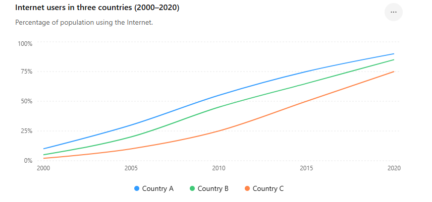
Example 1: Internet Users in Three Countries
The line graph illustrates the percentage of people using the Internet in three countries between 2000 and 2020.
Summarise the information by selecting and reporting the main features, and make comparisons where relevant
Band 7-8 Sample Answer
The line graph compares the proportion of Internet users in three countries over a twenty-year period from 2000 to 2020.
Overall, Internet usage increased substantially in all three countries. Country A consistently recorded the highest percentages throughout the period, while Country C had the lowest figures despite experiencing significant growth.
In 2000, only 10% of people in Country A used the Internet, compared with 5% in Country B and just 2% in Country C. By 2005, these figures had risen considerably to 30%, 20%, and 10% respectively.
The upward trend continued over the following years. In 2010, Internet penetration reached 55% in Country A and 45% in Country B, whereas Country C remained considerably lower at 25%. By 2015, usage rates had climbed to 75%, 65%, and 50%.
At the end of the period, Internet access became widespread in all three nations. Country A reached 90%, while Country B followed closely at 85%. Country C also experienced remarkable growth, finishing at 75%.
Example 2: Tourist Arrivals to a Country (2005–2025)
The line graph shows the number of international tourists visiting a country between 2005 and 2025.
Summarise the information by selecting and reporting the main features, and make comparisons where relevant.

Band 7-8 Sample Answer
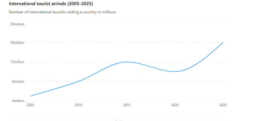
The line graph illustrates the number of international tourists who visited a country from 2005 to 2025, measured in millions.
Overall, the number of visitors increased significantly over the period despite a temporary decline between 2015 and 2020. The highest figure was recorded in 2025, while the lowest was seen at the beginning of the period.
In 2005, the country welcomed approximately 5 million international tourists. This number rose steadily over the following decade, reaching 8 million in 2010 and then increasing further to 12 million in 2015. This represents an overall growth of 7 million visitors during the first ten years.
However, tourist arrivals fell slightly to 10 million in 2020. Despite this decline, the figure remained considerably higher than the levels recorded in the earlier years. Following this period, tourism recovered strongly and reached a peak of 16 million visitors in 2025.
In summary, international tourism experienced substantial long-term growth, although there was a brief setback before visitor numbers reached their highest level at the end of the period.
Useful Vocabulary for This Graph
increased steadily
rose significantly
experienced growth
reached a peak of
declined slightly
recovered strongly
the highest figure
the lowest figure
overall upward trend
Structure Used
Introduction
Paraphrase the question.
Overview
Overall increase.
Temporary decline.
Highest and lowest points.
Body Paragraph 1
Data from 2005–2015.
Body Paragraph 2
Data from 2015–2025 and final comparison.
Example 3 : Mobile Phone Ownership Among Adults (2000–2025)
The line graph shows the percentage of adults who owned a mobile phone between 2000 and 2025.
Summarise the information by selecting and reporting the main features, and make comparisons where relevant.
Band 7-8 Sample Answer
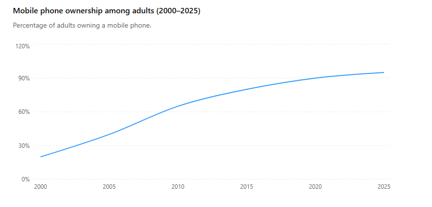
The line graph illustrates the proportion of adults who owned a mobile phone over a 25-year period from 2000 to 2025.
Overall, mobile phone ownership increased dramatically throughout the period. The most significant growth occurred between 2000 and 2010, while the rate of increase slowed slightly in the later years. By 2025, mobile phones were owned by almost all adults.
In 2000, only 20% of adults possessed a mobile phone. This figure doubled to 40% by 2005 and then rose sharply to 65% in 2010. Therefore, the percentage increased by 45 percentage points during the first decade.
Growth continued after 2010, although at a slower pace. Mobile phone ownership reached 80% in 2015 before climbing to 90% in 2020. By the end of the period, the figure stood at 95%, representing the highest level recorded on the graph.
In summary, mobile phone ownership became increasingly widespread over the period, rising from just one-fifth of adults in 2000 to nearly universal ownership in 2025.
Key Features to Notice
Highest figure
95% in 2025
Lowest figure
20% in 2000
Overall trend
Strong upward trend throughout the period
Most significant increase
Between 2000 and 2010 (20% → 65%)
Useful IELTS Vocabulary
increased dramatically
rose sharply
doubled
climbed steadily
experienced significant growth
reached a peak of
stood at
nearly universal ownership
upward trend
percentage points
Estimated Band Level
Task Achievement: Band 8
Coherence & Cohesion: Band 8
Lexical Resource: Band 8
Grammatical Range & Accuracy: Band 7–8